
Having a checklist or a systematic and standardized approach to tasks, procedures, or processes should not be limited only to high-stakes professions like nursing, aviation, and surgery. Applying a framework for your higher education website and UX web strategy helps your student journey and has a direct impact on your enrollment, student retention, and reputation. At KWALL, we continually strive to improve the .EDU space and provide insights and solutions to the sometimes overcomplicated navigation maze that doesn’t reflect nor highlight the voice, branding, or capabilities of your institution.
Use this checklist for the three essential elements of your higher education website design to streamline and focus your UX strategy.
1. General Information
Homepage
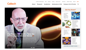
The homepage is the grand entrance to your academic world. It’s where prospective students, parents, alumni, and partners gather to understand who you are and what you stand for. Its clarity and precision convey your commitment to excellence. A well-crafted homepage assures them that they are in the right place.
- Is it clear who the target audience is? Is the information hierarchy according to that target group?
- Hero space should showcase initiatives, news stories, or events.
- If featuring a story, use headlines to describe what the story is.
- Use images to reflect university values and priorities.
- Include a link to the career site in the page footer.
- For mobile users, prioritize tasks for current and prospective students.
About
Behind every great institution, there’s a captivating story. The ‘About’ section is where you pen that narrative. It’s your opportunity to speak to the soul of your institution, to unveil its history, ethos, and aspirations. It’s where you declare, ‘This is who we are, and this is what we believe in.’ Make sure it’s compelling and up to accessibility standards.
- Can visitors pinpoint main facts and stats about the campus right away?
- Include a unique tagline.
- Make it easy to scan key figures and quick facts.
- Include profiles of top administrators with photos.
- Highlight information about the town.
- Offer multiple paths to access the academic calendar.
- Provide a campus map with context, building names, and streets.
- Use Call-to-Actions (CTAs) like “Visit,” “Maps,” or “Campus Maps.”
- Link to the map from the utility navigation or the footer in the “Visiting University” section.
- If there are multiple university campuses, provide links to them.
- Indicate parking lots and visitor parking clearly.
- For virtual tours, consider using photos instead of 360-degree navigation.
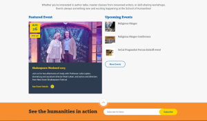
News/Events
In the academic world, knowledge is dynamic, and your ‘News/Events’ section is the platform where you share the pulse of your institution. Not just a bulletin, but an effective tool for enrollment as well. It’s where you breathe life into your academic endeavors and proudly display life on campus through your higher education website.
- Identify the type of news center (magazine, feed, hybrid) that suits your content.
- Consider how many news outlets (magazine, blogs, press releases, departments, etc.) are necessary.
- Include related links for news stories.
- Offer multiple ways to browse news, such as by topic, department, school, research center, and popularity.
- Allow the internal audience to submit news.
Directory
The ‘Directory’ section is where you extend a hand of accessibility, ensuring that anyone seeking connection can find it. A well-organized ‘Directory’ tells the world, ‘Our doors are open, and we’re ready to collaborate.’
- Enable search by name, partial name, keywords, department, email, phone, and role.
- Allow browsing by department.
- Avoid truncation and abbreviation on listings.
2. Information for Prospective Students & External Audiences
- For prospective students, include videos and photos of the actual school, focusing on students rather than university officials.
- Use authentic testimonials, preserving the exact wording of students.
- Include employment outcomes on the “About Us,” “Academic Department,” and Alumni pages.
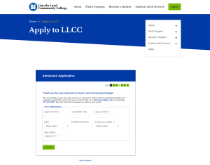
Admission & Tuition
- Make it easy to find information about different programs and the application process.
- For those not ready to apply, include “How to Apply” and “Admissions” sections.
- Clearly state application deadlines.
- Label different years of students, not just first-year applicants.
- List the steps of the application process, along with required materials.
- Provide cost information upfront, including tuition, fees, and estimated expenses.
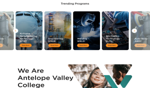
Academic Research & Programs
- Include academic programs on the main navigation.
- Organize programs by topic, making it interest-based.
- Offer guided pathways to help students choose programs.
- Include a list of degree programs and provide a brief summary of each.
- Highlight career outcomes and salary levels.
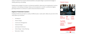
- Feature topical lists of research if research is a priority.
- On department research pages, list the names of researchers.
University Life & Student Services
- Use recognizable titles, such as “Student Life” or “Life at [University Name].”
- Showcase what it’s like to be a current student through pictures and videos of activities.
- Provide details about housing, clubs, dining options, and off-campus activities.
- Organize student services by topic or activity rather than organizational structure.
Alumni & Donors
- Offer the option to donate to specific initiatives.
- Highlight upcoming and ongoing projects funded by donations.
- Create clear pathways to the donation page, separate from the Alumni page.
- Provide quick access to common tasks for alumni, such as requesting transcripts and attending events.
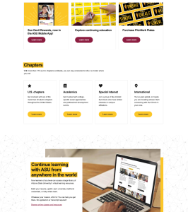
- Share alumni achievements and offer links to alumni networking groups.
3. Topic-Based and Audience-Based Navigation Structure
- Implement topic-based navigation for general content and audience-based navigation only when there’s sufficient content to support each group.
- Alternatively, list top links for main audience segments.
- Consider naming prospective students as “future students.”
- Include content for applicants in various stages.
Wayfinding
- Design for common user paths, making it easy for visitors to find related programs, departments, and offices.
- Provide links to the university homepage on every subsite for consistent wayfinding.
With this checklist, you can streamline your higher education website to make it more effective for students, prospective students, and external audiences. It ensures that your web strategy aligns with your institution’s goals of enrollment, retention, and reputation building. By systematically addressing these key elements, you can create a more user-friendly and impactful digital experience for your university community.
Book your slot now for an exclusive preview of our new Site Management and Intelligence Platform, scheduled for September 13, 2023 or contact us at KWALL for more information.


